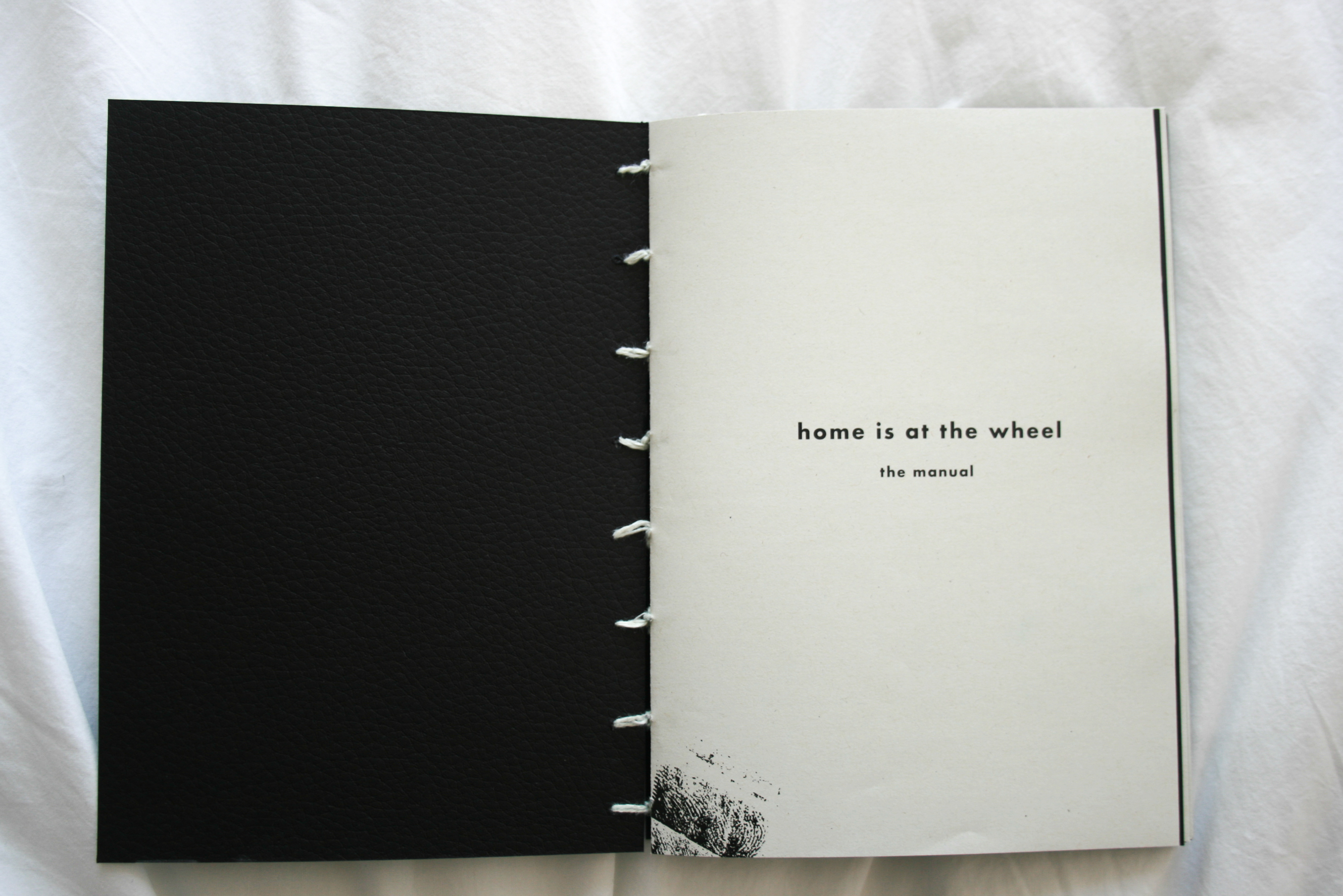
Home is at the wheel
Experience Design
The Visuals ︎︎︎
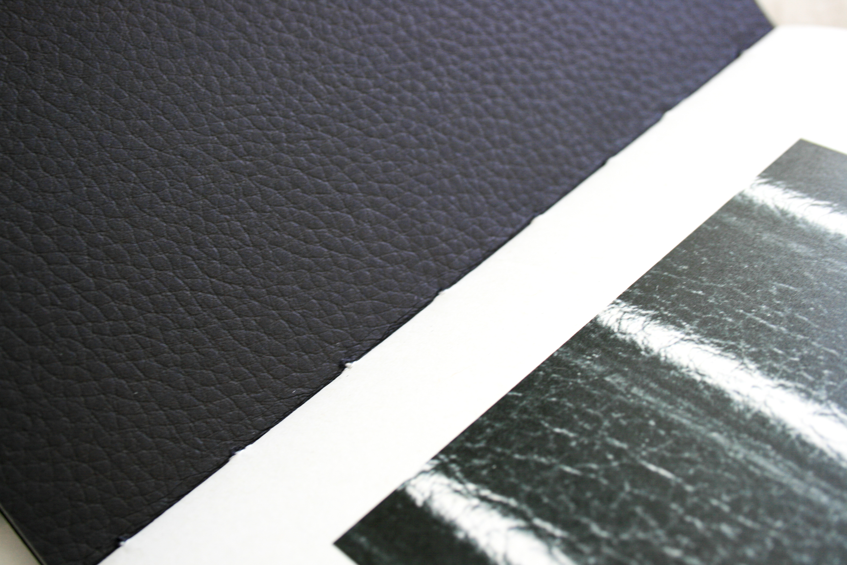
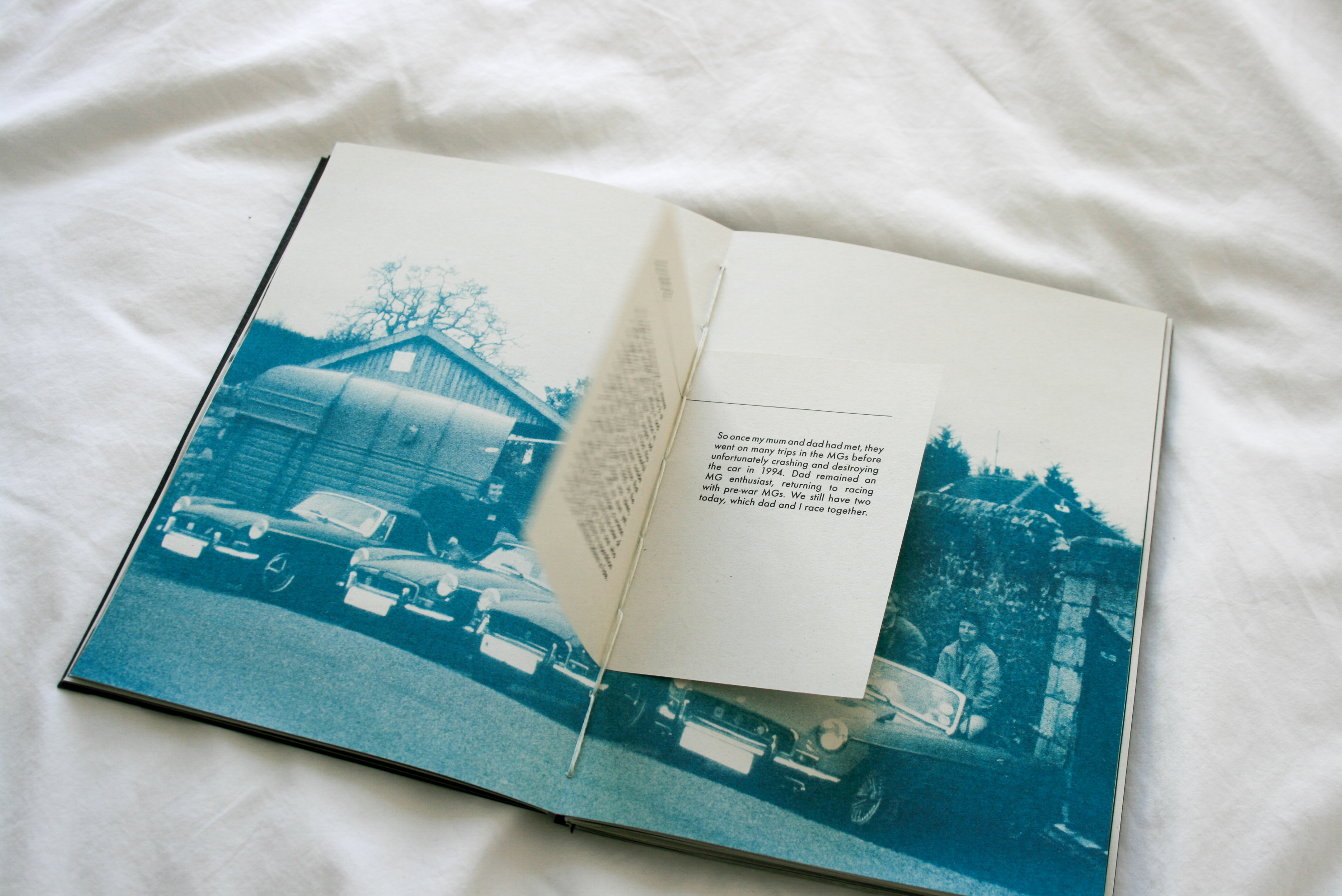
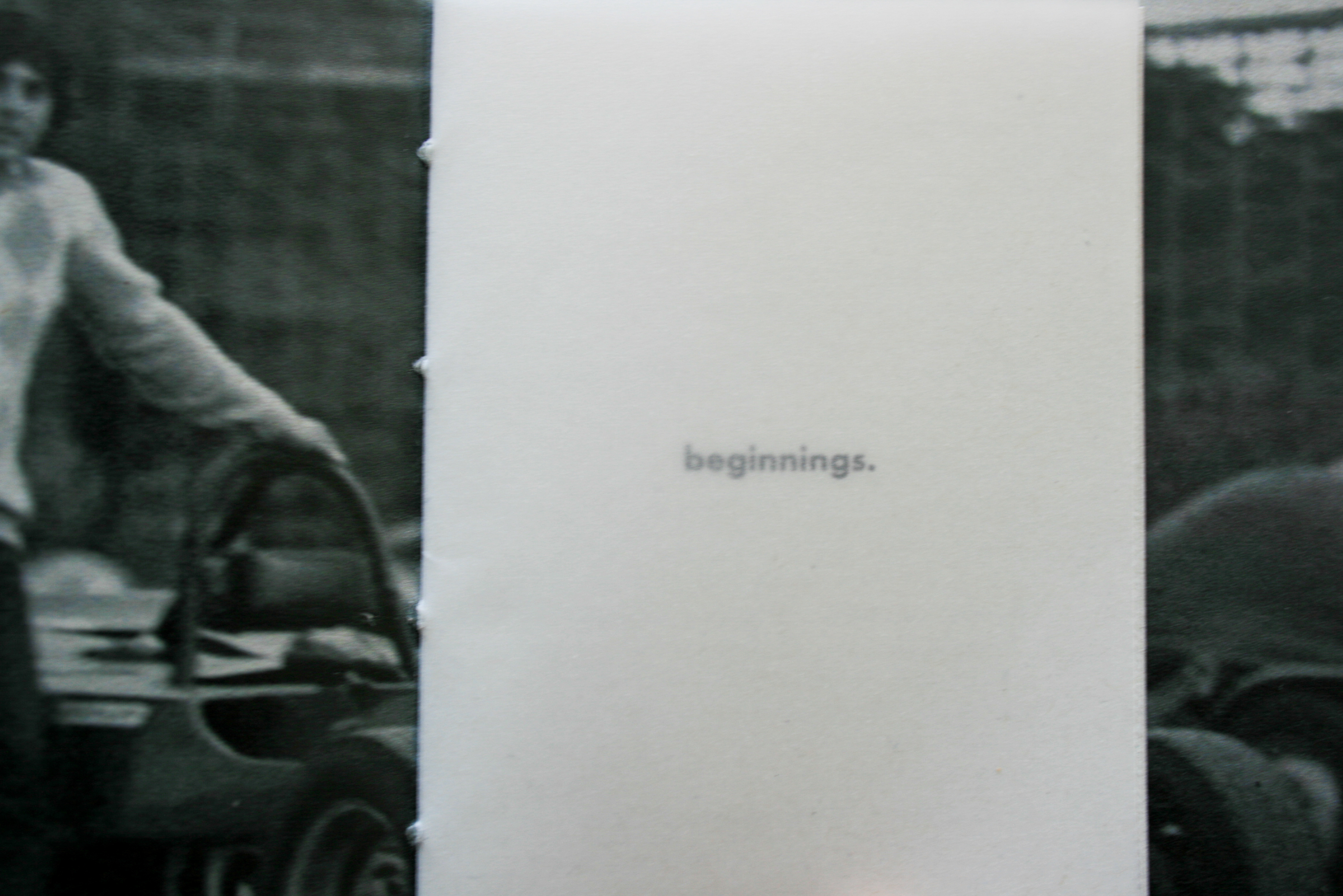
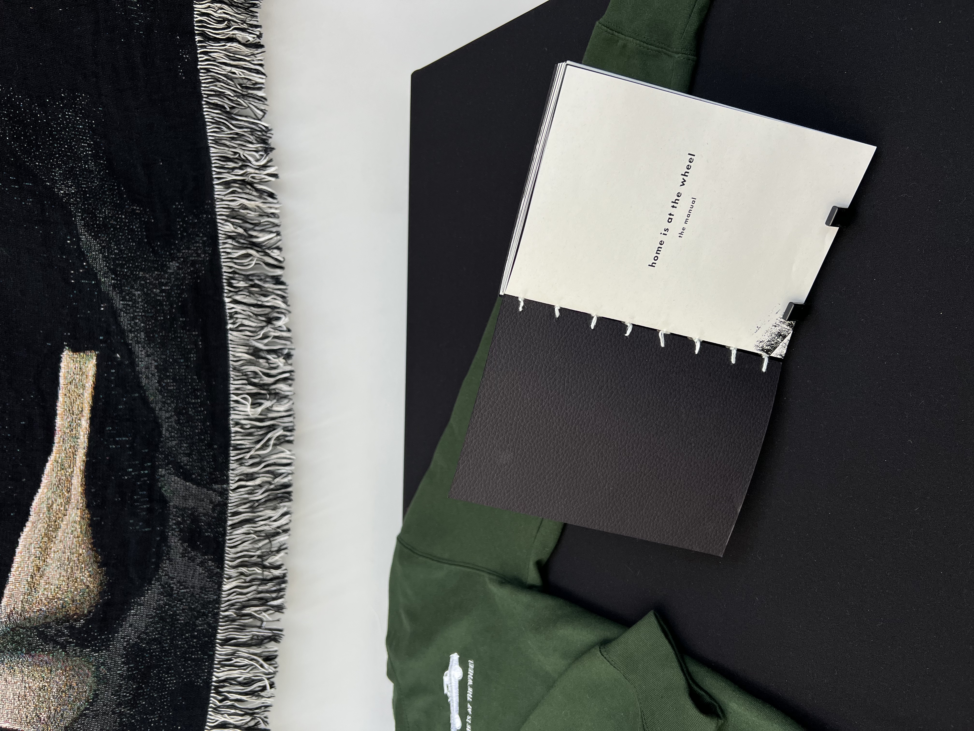
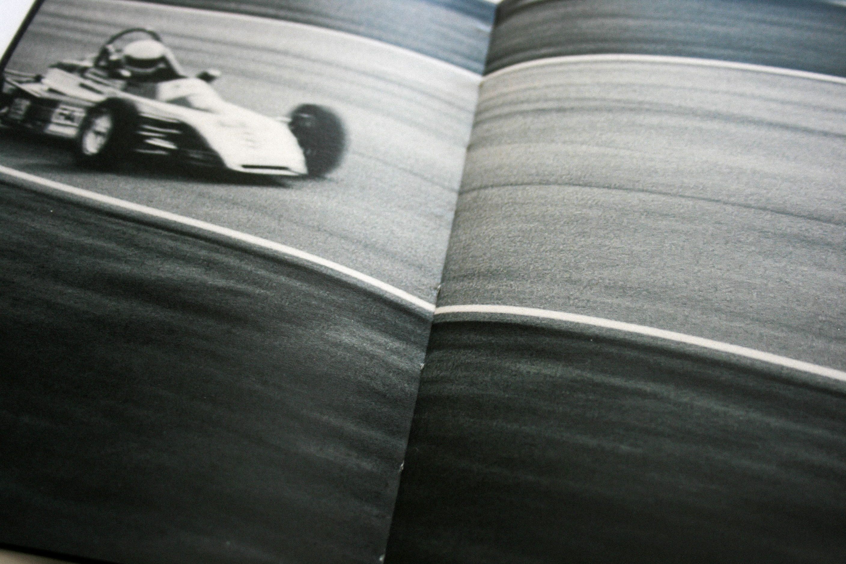
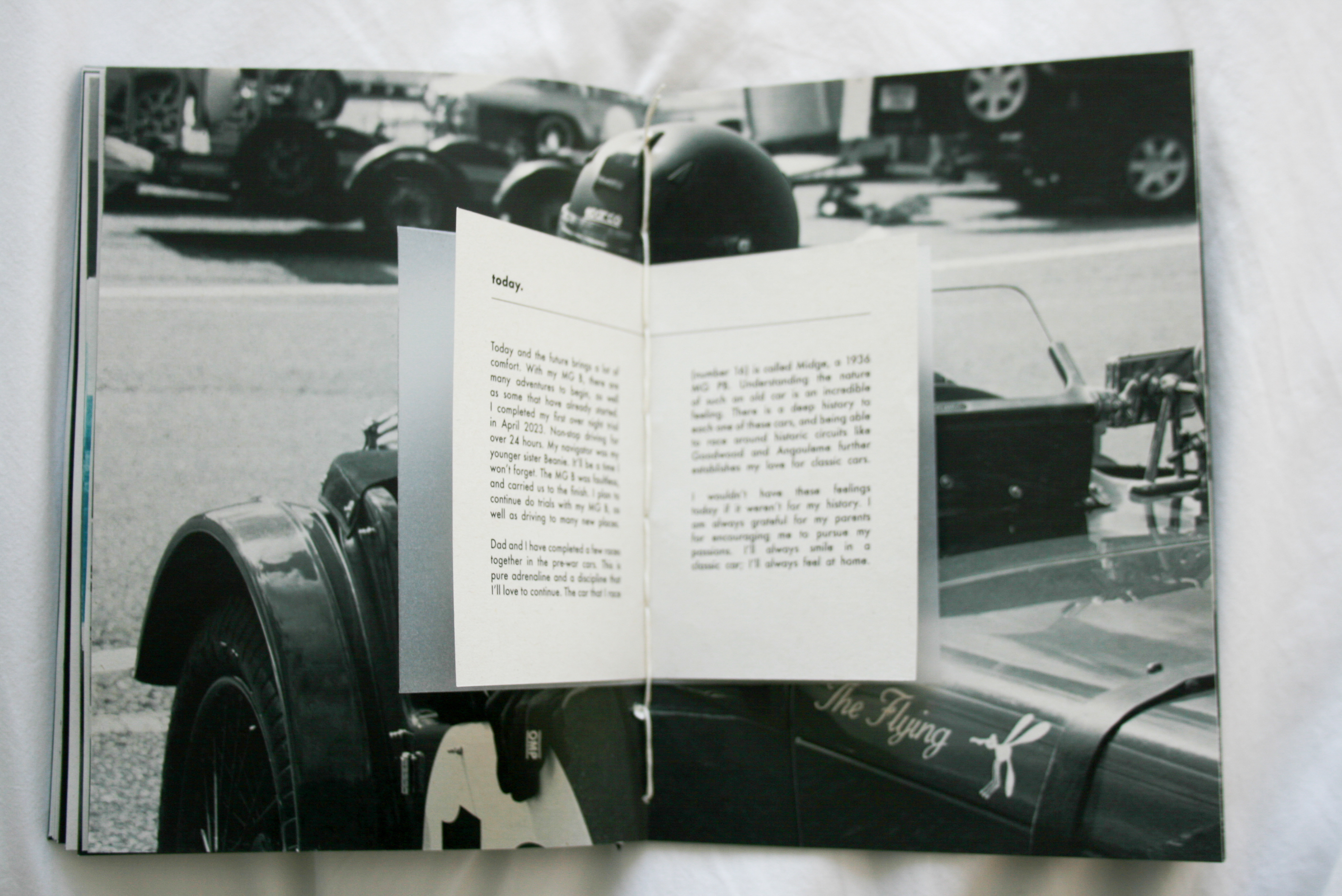
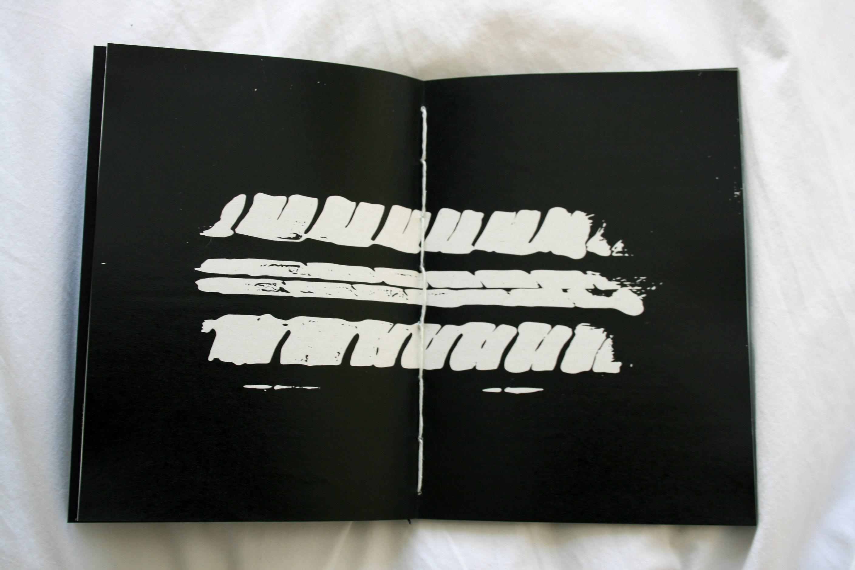
The manual ︎︎︎ As a passionate lover of classic cars, I delved into my family’s petrol head history to uncover the roots of my own fascination. Recreating the car manual became my canvas for expressing the visual identity for my project, telling the narrative of my past, my family, and the cars themselves. The publication reflects my narrative, from my parents’ time in their MG B to my own experiences. British Racing Green, like my Dad’s race MG, maintains a consistent color palette throughout. The A5 coptic bind features an A7 narrative booklet at its center, ensuring the imagery remains prominent. experimental elements such as tyre printing, petrol-soaked pages for scent, oil marks, and leather-textured paper stock bring a tactile and immersive quality. Including Riso printing image techniques to showcase the rich green hues that tie it all together.
The sweatshirt︎︎︎ A cherished childhood item is my father's automotive team sweatshirt, which holds sentimental value. I recreated it for this project, using British Racing green and adding a touch of petrol for its nostalgic scent.
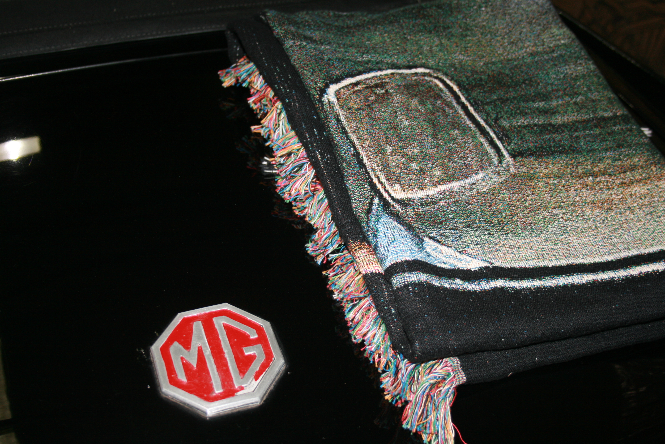
The woven blanket︎︎︎ The car blanket holds nostalgic significance from my childhood. wrapping myself in it after long race days felt like home. For its design, I wanted to express "home is at the wheel." The image of the car and its wheel symbolizes this concept and showcases my growth from the little me wrapped in the blanket to owning my own classic car.